


Ever wondered what those three little dots mean in an app? These dots, commonly referred to as the ellipsis or “more” button symbolize a way to access additional information. Whether it is hidden options in a menu or supplemental content on an app page, the ellipsis plays an important role when it comes to advancing the user experience.
What Are Ellipsis (The Three Dots in an App)?
Ellipsis comes from the Greek word meaning “omission”. It is used to represent an intentional omission of words in a quotation or text. In terms of digital design, it is usually used to indicate that additional content can be found by clicking/tapping on it.
Where Can We Find Ellipses?
Ellipse can be found in various places like websites and mobile apps since it implies that there is more information available beyond what you initially see. A common example would be “see more…” which uses the three-dot ellipse to provide access to additional information about something without having to directly click it first. This encourages users to explore further and find out more before making any decision or action related to the item being presented.
How Should We Use Ellipses?
For most cases, ellipses should follow standard punctuation rules such as ending with a period if needed and leaving one space between sentences/words when using them together with other punctuation marks like commas or question marks, etc.
However, there may be some variation depending on your design style preference as well as the context within which it appears in digital media i.e., different types of interfaces may lend themselves better to certain formatting styles than others). It’s also important not to overuse them as too many can make your app look cluttered and hard.
Colloquial Names and User Perceptions
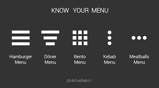
User perceptions of “colloquial names” such as vertical ellipsis, menu icons, and navigation bars can vary depending on context and cultural references. These elements are often referred to as “kebab menus” due to their similarity with shish kebab skewers, or simply mistaken for generic buttons like hamburger menus. With the normalization of these popular interpretations over time, people tend to forget their original definitions.
Examples Across Different Platforms
The form factor of three-dot menus may vary across different platforms but they still share similar functionality regardless of device type: Android apps typically feature small circular icons that appear either at the top right corner or bottom center; iOS apps usually almost if not completely identical in appearance but should not be confused with hamburger menus which have 3 horizontal lines instead; web applications present them within navigation bars (on desktop) while responding differently depending on input methods used (mobile vs tablet).
The Three-Dot Icon
The vertical ellipsis or the three-dot icon serves a crucial role in modern app design – acting as a gateway to hidden menus and additional features, allowing users to declutter interfaces and enhance experiences. As technology evolves, alternative navigation patterns may appear yet the three dots remain an important symbol of intuitive design. Appreciate the subtle power of the three dots on your digital journey.